Year
2026 - Ongoing
Scope Of Work
User Journey Mapping
User Research
Interaction Design


The cancel flow is the last conversation SocialPilot has with a paying user before they leave.
It used to be a single congested page, asking users why they were leaving, offering a pause option, and processing cancellation all at once. It was cluttered, it gave users very few reasons to choose from, and it gave us almost no useful data about why they were actually churning.
We redesigned it into a multi-step, intent-aware flow that meets users where they are, giving those who want to stay a clear path to do so, and making the exit easy for those who've made up their mind.

Churn was increasing, and we had almost no signal on why.
The existing cancel flow collected cancellation reasons, but only offered a handful of vague options which meant users were not providing the real reasons and were skipping all the options or information shown because it was all very conjusted.
Beyond the data problem, we started noticing a pattern in customer support tickets, users were reaching out after cancelling to ask about pausing, changing plans, or downgrading. They did not wanted to fully cancel, they just couldn't find any other way out.
We brought together Product, Customer Success, and Support to map out what users were actually experiencing and how we can fix it.
We had 2 goals which shaped the redesign:
Retain users who don't want to leave
Understand the ones who do, with richer, more actionable data
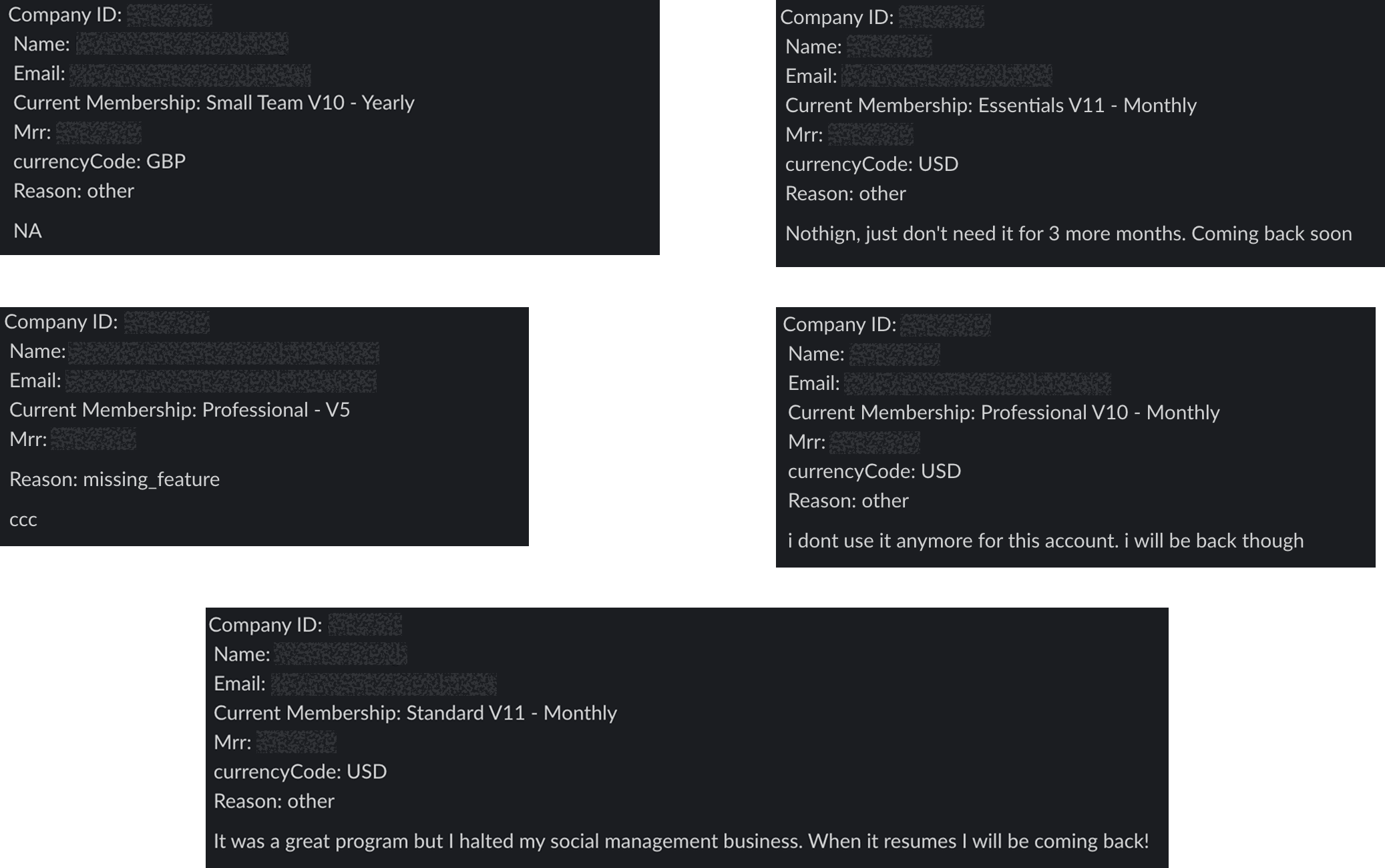
The existing flow had structural problems that made both goals impossible.
❌ No Pause, No Downgrade. Only Cancel
Users who wanted a break or a cheaper plan had nowhere to go. The "pause" option existed on the same cluttered page as cancellation but wasn't visible or prominent enough. Plan changes required navigating away entirely. So users cancelled, not because of conviction, but of not seeing another option.
❌ Sparse Cancellation Reasons
The old flow offered few reasons to select, forcing users to pick something that didn't truly reflect their situation. This made the data unreliable and nearly useless for improving the product or crafting retention strategies.
❌ One Page Doing Too Much
Pause, reasons and cancellation confirmation, all stacked in a single page. It was cognitively overwhelming and visually messy, with no clear hierarchy of what mattered most.
❌ No Retention Moment
Once a user clicked "cancel," the flow just processed it. There was no attempt to acknowledge their concern, offer something relevant, or give them one last reason to reconsider.

Our goals of pulling the users back and getting data from them came with its own set of challenges which could harm brand's value and user experience. We had to navigate clearly and carefully,
🛑 Avoiding Dark Patterns
We wanted to give users more control with features like multi-inbox and tagging, but without making the interface feel complicated. The goal was to keep things powerful yet simple, so users don’t get confused or slowed down.
🛑 Showing Options Without Burying the Exit
Making pause, downgrade, and plan change easy to find without making cancellation feel hidden, required careful hierarchy decisions. We didn't want users to feel trapped. The goal was to make the right alternatives obvious and not to obscure the exit.
🛑 Pulling the users back without desperation
Since users were used to the old layout, changing too much could confuse them. We redesigned the inbox to feel fresh but still familiar, so it’s easy to learn without starting from scratch.
After brainstorming with the team and gathering feedback from customer specialists, we finalised solutions for each challenge, giving us a clear direction to move forward.
✅ More visibility to "Pause", "Downgrade" etc
Rather than making "Cancel Subscription" a top-level action, we nested it inside a more options menu alongside "Pause Subscription," "Change Plan," and "Downgrade Plan." This showed alternatives that users didn't know existed, without hiding the cancel option.

✅ Dedicated CRM Section for Quick Support Access
Before users even reach the cancel flow, we added a support contact section which makes it easier to reach a human if their issue could be resolved. A significant portion of cancellations are frustration driven and not decision driven.

✅ Achievements Screen as the First Step
Instead of jumping straight to "why are you leaving," we show users what they accomplished with SocialPilot. Accounts connected, posts scheduled, notifications answered and reports generated. From here, they can one-click pause, book a call with support, or downgrade. All in context.

✅ Relevant Cancellation Reasons
We worked with Customer Success and analysed support survey data to build a comprehensive, specific list of cancellation reasons. Relevant reasons would give us quality data on why are users leaving and how could we improve it.

✅ One Last Relevant Pull - Reason matched nudges
When a user selects a reason, we respond with a targeted nudge:
"It's too expensive" → shows the downgrade option with a plan comparison
"I need a break" → one-click pause with date selector
"I couldn't find a feature" → links to a help resource or support contact
"I'm switching tools" → we acknowledge the decision, offers a parting resource
If they still want to leave after the nudge. That's it. We made the final cancellation step clean and fast.

Since the feature and its components were used extensively, we wanted to keep the design scalable and easy to update. To achieve this, we followed these design practices.
✅ Kept it ethical and no dark patterns
Every step of the flow was designed to give users a better option, not to obstruct their exit. The cancel button is always reachable. The nudges are informative, not manipulative.
✅ Progressive Disclosure
Instead of dumping everything on one page, we broke the flow into clear steps each with a single job. This reduced cognitive load and made each decision point feel considered rather than rushed.
✅ Easy to update nudge system
The reason-to-nudge mapping is built to be updated independently, so the team can A/B test different nudges, add new reasons, or update offers without rebuilding the flow.
✅ Consistent with SocialPilot's Design System
All components, tokens, and patterns align with the existing design system so the cancel flow feels like a natural part of the product, not a separate experience bolted on.